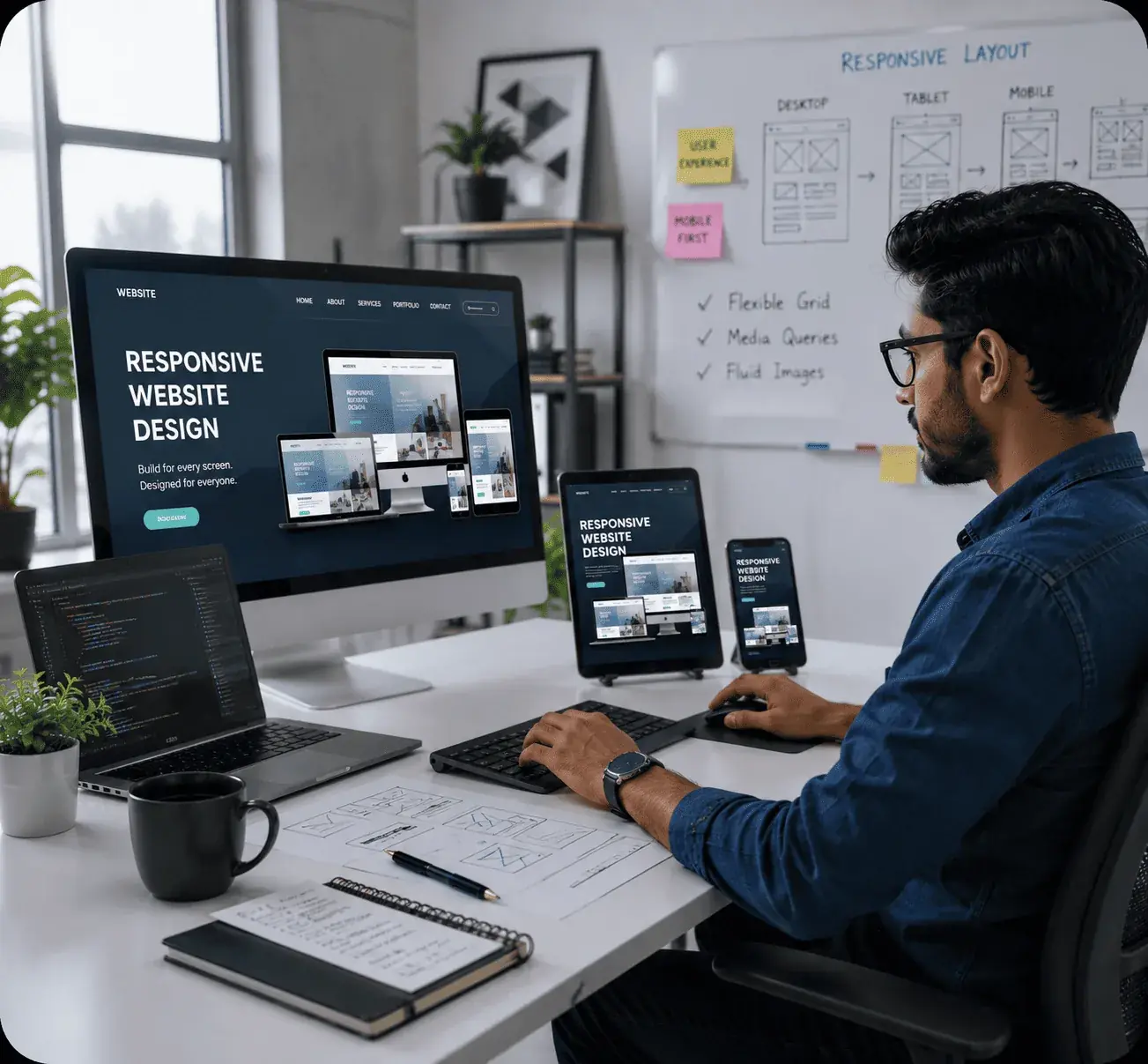
Seamless Design Across Devices
Responsive Websites That Adapt to Every Screen Size
At Agile Solutions, we create responsive websites that automatically adjust their layout, images, navigation and content for smartphones, tablets, laptops and desktops. Every interface is designed to remain clear, attractive and easy to use across modern devices.
Whether you need a new mobile-friendly website or want to make an existing website responsive, we deliver flexible layouts, touch-friendly navigation, readable content and optimized performance to provide visitors with a consistent browsing experience.
Talk To Us View Our Work
Our Responsive Design Expertise
Flexible layouts, mobile-first planning and optimized interfaces for a consistent experience on every device.

Mobile-First Design
Layouts are planned for small screens first and enhanced for tablets, laptops and desktops.

Flexible Layouts
Fluid grids and responsive sections adapt naturally to different screen widths and orientations.

Touch-Friendly UX
Buttons, menus, forms and calls to action are designed for comfortable use on touchscreen devices.
Cross-Browser Ready
Responsive interfaces are checked for consistent presentation across commonly used modern browsers.

Fast Performance
Optimized images and clean responsive code help pages load efficiently on mobile networks.
Mobile-First Design
Layouts are planned for small screens first and enhanced for tablets, laptops and desktops.
Flexible Layouts
Fluid grids and responsive sections adapt naturally to different screen widths and orientations.
Touch-Friendly UX
Buttons, menus, forms and calls to action are designed for comfortable use on touchscreen devices.
Cross-Browser Ready
Responsive interfaces are checked for consistent presentation across commonly used modern browsers.
Fast Performance
Optimized images and clean responsive code help pages load efficiently on mobile networks.
Our Features
Our Responsive Website Design Services
We design flexible, mobile-friendly interfaces that provide smooth navigation and readable content across all screen sizes.
Mobile-First Website Design
We prioritize mobile usability, readable content and clear navigation from the beginning.
Multi-Device Compatibility
Website layouts adapt smoothly to smartphones, tablets, laptops and large desktop displays.
Fluid Grids & Flexible Images
Responsive grids and scalable media adjust correctly without unwanted overflow or distortion.
Mobile Performance Optimization
We optimize responsive assets and layouts to support faster loading on mobile devices.
Touch-Friendly Navigation
Menus, buttons, forms and interactive elements are made comfortable for touch interaction.
Cross-Browser Testing
We test responsive behaviour across popular modern browsers for consistent presentation.
Readable & Accessible Layouts
Clear spacing, scalable typography and structured content improve readability across devices.
Our Packages
Responsive Website Design Packages
Choose a responsive design package based on your website size, page requirements and desired functionality.
Basic Package
- Up to 5 Responsive Pages
- Mobile & Tablet Optimization
- Basic On-Page SEO Setup
- Responsive Contact Form
- 1 Month Support
Standard Package
- Up to 10 Responsive Pages
- Custom Mobile-First Layout
- Advanced On-Page SEO
- Cross-Browser Testing
- 3 Months Support
Premium Package
- 15+ Responsive Website Pages
- Advanced UI & UX Design
- Speed & SEO Optimization
- Custom Forms & Integrations
- 6 Months Support
What We Do
Creating Mobile-Friendly Websites for Every Business
At Agile Solutions, we combine responsive layouts, mobile-first planning, touch-friendly navigation and performance optimization to build websites for companies, clinics, institutes, consultants and service-based businesses.
0
Projects Completed
0
Happy Clients
0
Years Experience
Responsive Website Design FAQs
Frequently Asked Questions
Find answers to common questions about our mobile-friendly responsive website design services.

Build a Fast, Mobile-Friendly & SEO-Ready Responsive Website
Need a website that looks professional and works smoothly on every device? Agile Solutions provides responsive website design services in Jaipur with mobile-first layouts, flexible grids, scalable images, touch-friendly navigation and cross-browser compatibility. We create websites that help customers browse your content, use forms and contact your business comfortably from any screen size.